Background: Minimal Posters
Layout
Before we start discussing the formal elements of layout, please remember that it’s important to know the rules before you can break the rules!
Whether you’re creating a vertical or a horizontal layout with an even number of columns or odd, you need to know what you're trying to achieve before you start.
Look at the following site to help work out where you’re heading: http://www.designersinsights.com/designer-resources/using-layout-grids-effectively/
Layout is possibly the most fundamental of all design concepts, and we’ll touch on some of the key elements below.
It’s worth remembering that there are far too many nuances in design for us to touch on all of them here, so we heavily encourage further background reading.
You also need to understand basic principles of design in order to convey their messages to their own audiences. For this reason, we're going to work with the acronym; C.R.A.P.

Students and staff alike find the acronym comical, but sometimes these mnemonic devices can be just the trick to get ourselves to reflect on our own decision-making with regards to design and layout.
- (C) Contrast - Variation in shapes, text, images, and alignment creates focus and emphasizes parts of the layout
- (R) Repetition - Creates uniformity between images, text, and style in order to produce an easy flow for navigation
- (A) Alignment - Lining up the placement of text and images in order to create a clear and organized layout
- (P) Proximity - The grouping and arrangement of graphic objects, text, and images to create a connection throughout the image
By working with these four basic principles, you can then create the following:
- Emphasis: Creating a centralized focal point
- Balance: Create mood or stability/tension
- Symmetry: Formal balance
- Asymmetry: Informal balance
- Radial: Arranging elements around a central point
- Rule of Thirds: Off-center graphics to create interest
- White (Empty) Space: Gives visual contrast, and breathing room for the eyes
Knowing a little about the use of layout for this week’s assignment will be helpful in terms of ensuring you understand the norms and conventions of this week’s assignment based on film posters.
Take a quick look at this excellent site showing a short history of film posters before learning more about film poster design and watching this week’s lecture video. http://www.thegroundmag.com/movie-poster-art-a-short-history/
In this lesson we’ll bring together everything we’ve discussed so far to create a project with the goal of conveying a complex idea using a simple representative graphic.
Minimal Posters
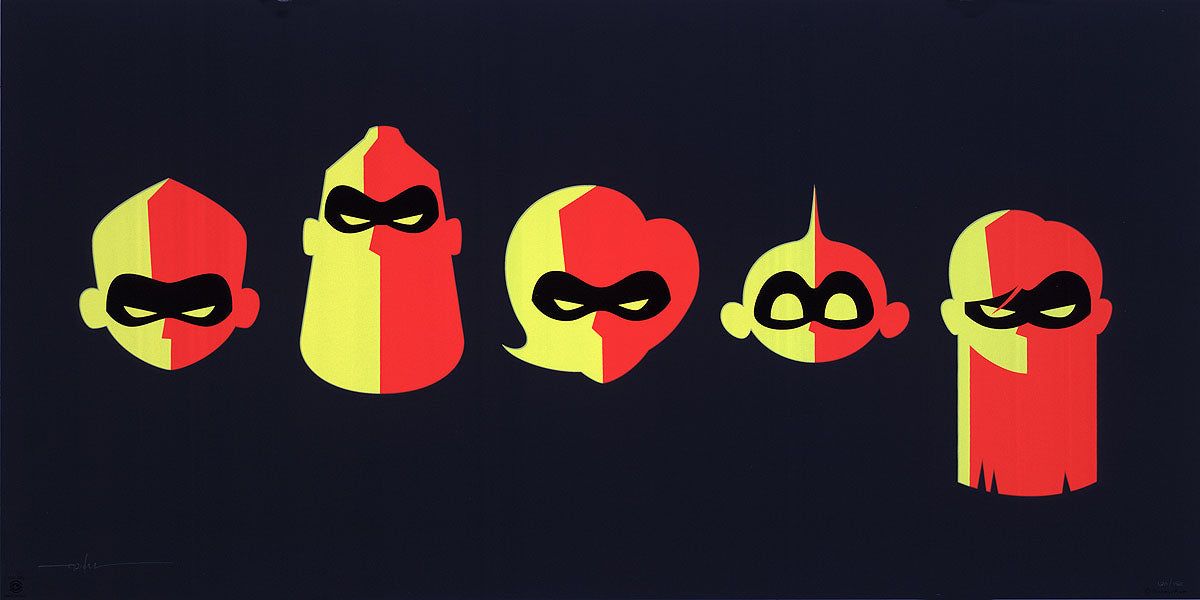
The idea of reducing a well known movie, book or other piece of complex narrative to a simplified graphic may seem easy on the surface, but it's essentially an exercise in graphic design combined with problem solving - finding the most important elements of the narrative and highlighting them. Here are a couple of examples.


This project is a great way to introduce creative problem solving through a shared cultural experience, and explore what is and what isn’t important in a design.
As we reduce a two hour movie into a single still image a magical thing can happen. It’s a space in time when true clarity enters the scene.
It’s a remarkable thing to create a movie poster when you really consider the enormous task at hand. You're trying to decide what parts of the movie are actually most important without giving away the ending.
Through this process we're left with only the essential elements of the subject matter, and can hopefully use them to create a graphic which is both minimalistic (it doesn't give much away), but also representative. We're left with only the essential elements to the movie which provides clarity to the person who is interpreting the visual message we're sending. It's a quick visual with a clear message intended to interest a person enough that they will go buy a movie ticket.
By clearing away all of the clutter, we create a simple and clear message to the audience about what kind of emotional experience they can expect by watching the movie.
Watch this short video that demonstrates the artist's ability to reduce characters from the movie Inside Out into abstract shapes:
Inside Out Featurette - Abstract Sculptures (2015)
Consider the following things:
- How can unnecessary elements of the key concept be eliminated without leaving a hole in the design?
- Could these elements be incorporated into the design in another way?
- What are the key design elements, and can we change the design so that they carry more meaning?
This poster for The Birds also reflects a key moment in the film. Only a few bird shapes are used in the design, and they're repeated over and over again to create the flock.
Negative space is cleverly used to make the shape of the woman who is frantically trying to fend off the birds. Again only two colours are used. Also, notice the clever use of the bird shape in the text.


The challenge is not what needs to be portrayed in the image, but more of what doesn’t need to be there. We suggest you draw up a rough sketch and then decide what isn’t helping to tell the story.
The minimalist design below (created by George K) uses the barest of elements to get a message across. A few colours and shapes are used to portray the key theme of a movie - can you guess which one?